OpenNMS Brand
Guidelines & Resources
This page is a home base for the OpenNMS visual brand language. It’s a place you can return to when you have questions about visual elements or when you’re creating brand materials. It’s meant to be a living, breathing space—a place where we can continue building our visual language to reflect changes to the brand.
All use of OpenNMS trademarks must comply with our Trademark Policy as well as any guidelines shared here.
Shared Responsibility
As an ambassador of our brand, you are encouraged to consistently use resources and guidelines. Please keep in mind that we’re all individually responsible for protecting our brand and developing a cohesive brand identity. Every brand touchpoint creates an impression of OpenNMS. Consistently managing that experience is extremely important on our journey as a distinctive brand.
Why Guidelines?
Distinctive brands are built on the foundation of consistent communications that deliver on a promise, and by doing that, develop trust. These guidelines should be used to help prepare materials for OpenNMS that adhere to these brand standards.
Logo
OpenNMS’ logo mark is based on the gyroscope. The gyroscope embodies the spirit of precise navigation and continuous calibration that we create every day.
Just like OpenNMS, the Open Gyroscope is made of multiple pieces working in harmony to show the way and help you stay the course.
The logo mark should always be used in in the full lockup, including the logotype, except for special cases (which might include a favicon, icon, or on swag).

Lockups
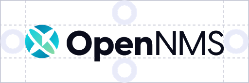
The horizontal logo is the preferred version, to be used whenever there is space. The full color versions are the preferred logos, but all are acceptable.
If the background color is too saturated or competes with the logo colors, an all-white version of the logo is available. Likewise, if the logo can only be used in black and white, an all-black version of the logo is available.
In situations where space is limited horizontally, you can use the vertical logo. For all other uses, the horizontal logo is preferred.


Accessibility
The full color logo should only be used on very light or very dark backgrounds. The higher contrast there is between the logo and the background, the more visible and high-impact it will be.
When you must use the logo on top of an image, ensure that it is placed on a very light or very dark part of the image that is consistent in color (not highly patterned).
Clearspace
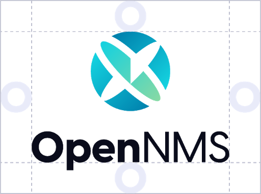
To maintain the integrity of the OpenNMS identity, keep a fixed amount of open space around the entire logo to help it stand out. An appropriate clearspace for both the horizontal and vertical logos is equal to the height of the “O” and proportional to the size of the logo being used.


Logo Don'ts
Only use approved versions of the logos. Avoid these incorrect treatments of the logo.
Do not use custom color fills or inadequate color contrast. Do not rotate or distort the logo, adjust the size relationship between the logo mark and wordmark, change the location of the logo mark, or replace the “O” with the logo mark.
Color
Because colors are created differently in different media, colors are defined for print (CMYK), special print colors (PANTONE® spot colors), and screen colors (RGB). For flexibility and variety, the OpenNMS color palette is a broad spectrum divided into three parts.
Primary Palette
Inspired by open air and sea, the primary palette colors reflect the calm and confidence that comes from OpenNMS.These colors should make up the majority of the color you see when you look at the full visual brand.
Supporting Palette
The supporting palette is a more diverse spectrum than the primary palette. These colors infuse balance and vibrancy into the brand visuals to create moments of high impact and contrast.
Neutral Palette
The neutral palette is a necessary tool to create rest for the eye. These colors will be most commonly used as background fields and text. The Subtle Gray, in particular, is intended for very subtle background delineations from white such as in a web page layout.
Typography
The relationship between fonts give a brand its identity and its messages a voice. When used effectively, typography adds an essential dimension and distinctiveness to communications.
Inter and Open Sans
The OpenNMS typefaces are Inter and Open Sans, which come in a variety of weights and offer flexibility of use. Consistent usage of these typefaces reinforces our brand language.
Both Inter and Open Sans are Google fonts, which are open source and free to download.
Headlines and
subheads use Inter
Inter is an open source font built for readability on computer screens
Body copy uses Open Sans, an open source font built with open forms and a neutral, yet friendly appearance. Open Sans is optimized for print, web, and mobile interfaces, and has excellent legibility characteristics in its letterforms.
Whenever setting type in color or on backgrounds, be sure to check accessibility standards to ensure sufficient contrast.