Introduction
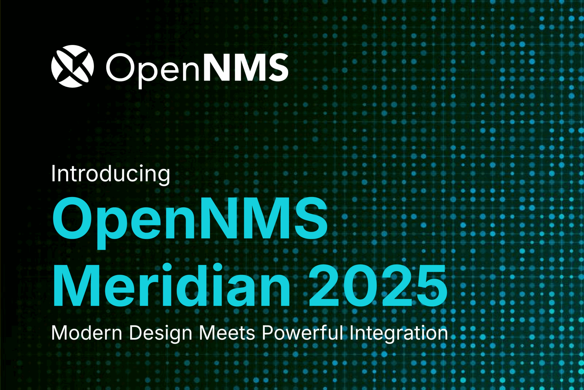
At OpenNMS, we’ve always believed that powerful functionality should be paired with intuitive design. When Meridian 2025 is released in Q4, we’re excited to introduce a major overhaul of our user interface—one that makes it easier, faster, and more intuitive for users to get value from the platform.
Why We’re Updating the UI
The goal of this project is simple: reduce the time it takes for users to go from installation to insight. That means streamlining the experience from login, through node setup, to viewing alarms, outages, and reports.
As Christopher Wong from our UX team put it:
“Getting lost in the very first step does not really help anybody. This project is about clarifying the path—especially for new users—so they know exactly where to go and what to do next.”
This isn’t just about aesthetics. It’s about usability, accessibility, and speed. Research shows that companies who invest in UI improvements see benefits like increased revenue, reduced support costs, and improved customer retention. A well-designed interface builds trust, improves engagement, and helps users accomplish tasks more efficiently.
What’s Changing
Here’s what users can expect:
Christopher explained the challenge this way:
“We had over 40–50 menu items scattered across regular and advanced options. Some features—like Business Service Management—were buried so deep that users couldn’t find them, even after we improved them. This redesign brings those features to the surface.”
Behind the Scenes
This project began in late May 2025, and has been a collaborative effort across UX, engineering, our product teams, and the community. We’ve removed outdated toolkits and moved closer to a pure JavaScript architecture, making future updates easier and more sustainable.
One of the biggest technical challenges was scaling the menu system. As Christopher noted:
“We had to rethink how menus expand. Instead of a long scrollable list, we now use a side-view pop-out—consistent with modern design patterns and easier to navigate.”

We are using the Feather DS design system to power these changes. We built Feather DS an open-source design system under the Apache License, which focuses on simplicity, consistency, and accessibility.
Looking Ahead
These updates mark a major step forward in making OpenNMS more approachable and efficient for both new and existing users. We’re excited to share these updates and look forward to hearing your feedback. This is just the beginning of a more intuitive, powerful OpenNMS experience.